David Schultz
Notifications


Customer Goal
I want to be informed on my phone when Amazon ships or delivers a package, or has a special deal on one or more products.
Role
Lead Designer (solo)
Key Deliverables
- Wireframes
- UX specification
- Finding and logging implementation bugs
- Final visual assets
Impact
- Notifications shipped in both the iPhone and Android shopping apps in late 2012 with fast adoption and broad use, especially for deals
- Customer satisfaction increased, and more deals were viewed (adding an ingress point from the Thank You page was especially effective)
Process
I worked on mobile notifications for Amazon’s deals and shipping information in late mid 2012 on the iPhone, with a fast follow for the Android platform. I dove deep with the product manager on the business logic, and the development teams on the native and server components, to learn the capabilities and constraints of the notification system that included the back end, OS and the shopping apps. Given the complexity and all the moving parts of the system, the requirements gathering phase easily took as much time overall than the rest of the design.
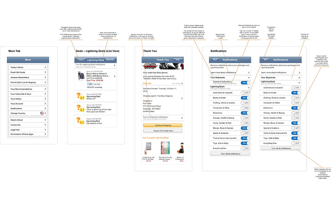
Next, I created wireframes to review with the team to ensure the business requirements and logic were met, and the development team could deliver the required experience. Originally, there were going to be more categories of notifications and the deals notifications would also provide a switch for each category. As such, I designed an experience using expandable groups to show or hide the switch(es) for that group. For example, if the customer reached the settings page via Deals, only the Deals group would be expanded. I also created basic flows to illustrate the process for stakeholders because the system wasn’t in place yet for them to try it out.
Later in the design process, I created comps so that we could play around with text strings and formatting both for the US and elsewhere. I also created versions of our app icon that would fit in various locations, such as the phone’s status bar along the top of the screen, and could be resized automatically by the OS.
Lessons Learned/Constraints
- Despite the best intentions of the Designer and development team, sometimes the OS will do things… unusual things… to your assets and there may be nothing that can be done about it
- Nail the basic use case first before pushing further, such as designing and implementing stacked notifications in Android (after all, what if it had turned out customers didn’t really want to use notifications?)
- Providing an ingress point to a feature when it contextually matters to the customer is very powerful – much more so than simply providing a page in Settings
- Designing a flexible interface for future functionality is well and good, but things should be made simpler for the customer at some point of that future functionality is continually pushed into said future
Additional Context
One of the biggest challenges on both OSs, though Android was worse due to legacy app and OS version support a the time, was determining which asset was used by the OS with the notification, the size of it, whether we provided multiple sizes or it was re-sized by the OS, as well as how to make the app icon look good at the various small sizes. Another challenge was coming up with a flexible layout that accommodated what was originally going to be three “buckets” of different notification types, each of which could have between one and thirty switches.